Summary: Latitude vs. X
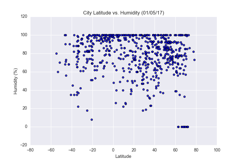
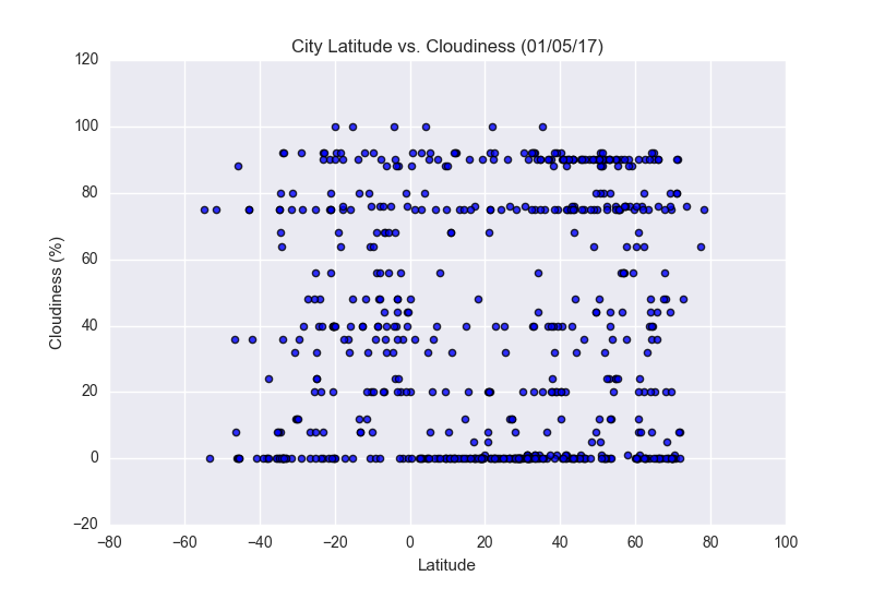
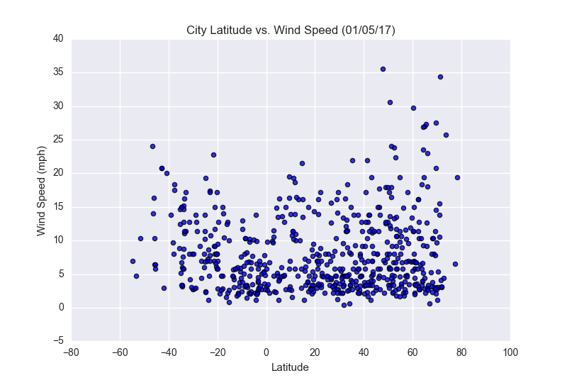
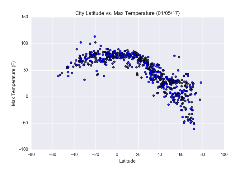 The objective of this project was to analyze the changing patterns in weather as one approaches
the equator. To accomplish this, we used the OpenWeatherMap API to retrieve data from over 500
cities in order to compare and contrast their differences based on their latitude.
The objective of this project was to analyze the changing patterns in weather as one approaches
the equator. To accomplish this, we used the OpenWeatherMap API to retrieve data from over 500
cities in order to compare and contrast their differences based on their latitude.
After gathering our desired data, we created visualizations using MatPlotLib to analyze trends across
several desired variables, namely temperature, cloudiness, wind speed and humidity to visually show the
relationship between latitude and weather.
This site provides the visualizations and data, along with explanations of trends for each graph. To see
these visualizations and their explanations, please click on the desired graph on the right, or navigate
to the desired page using the dropdown menu above labeled "plots".
Visualizations